Tuesday, 28 June 2011

The New New Header!

Hello again! Attempting to write this blog straight into the blogger 'composer' instead of C&Ping from word, hoping to not encounter various issues I had on my other blogs...

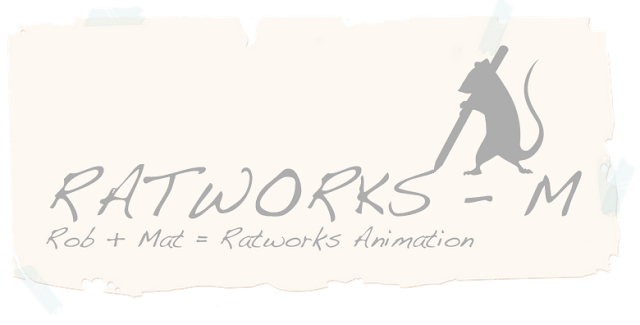
Yet another attempt at the design of the header! It may seem like an insignificant thing, but rob and I will have to stare at it for the best part of a year, so it has to be good!

As we discussed, I've tried the resized paper texture header, I like the scale and position of the logo above the writing now! And also vectored the cheese background to make it look more cartoony, which I think works well!


Here they are!


What you reckon now Robear?

Interesting note... The built in blogger uses a ridiculously small or ridiculously large arial font... I'll be C&Ping from word from now on!

Monday, 27 June 2011

The All-Important Header... Now With Added Logo!


Well, after the enthusiastic response I got from Rob for the logo’s we had a brief discussion and decided that the grey logo suited the colour theme that we want to go for. So with a finished logo in mind, the next task, is to include it in our blog headers, and change the logo itself into a .png format with alpha channels, so we can quickly use it to watermark any work or images we use.

So, here is the logo in .png with alpha channels (Rob you should be able to download it straight from here, if not I’ll email it to you).


The first thought was to simply add the full logo in the bottom right (pretty much how I intent to use it as a watermark).


But, honestly it feels like a totally unpolished header, so I went back to the logo file and removed the text from it, just for use in the header, and came up with these:


Which I actually quite liked, the first one in particular, though I feel the sizing and positioning should have been somewhere in between the two... Then I had another little thought, so I took some liberties with the whole design and came up with these bad boys:


Wocha reckon then Robear?

Saturday, 25 June 2011

Logos Galore!


Thought it was about time that I got these sketches uploaded for everyone (probably just Rob) to see. First are a few of the simple concept sketches I did, while I was brainstorming on my sketchbook in bed.


Note to self: when scanning in an image, be sure to ink the lines first, pencil really does not scan well at all.

I think a logo should be quite simple and preferably instantly recognizable; be it through colours, or shapes. Being in the creative field that we are at the moment I think it’s fairly important to not just have a simple circular emblem with initials in it like so many companies use, but it’s also important for it to be relevant. So I started to sketch simple shapes, keeping the shape of our official mascot rodent in mind. I quite liked the first idea (top left) but decided to keep going, I’m sure there’s some kind of law against settling for your first idea!

 
These are further sketches I did in photoshop, still keeping to the rat theme, but slightly less simple. Most of them didn’t feel like they had much potential for being a logo, but I did like the rat sat at the computer, which I almost did settle on. Then I did the bottom sketch just randomly, which I really love, and am hoping Rob likes too! It’s a simple silhouette, it includes our name, it sticks to a simple square form, and… It’s fun! LIKE IT ROB! =P

Here is the logo, in the silhouette form, completely undecided on a colour (any thoughts Rob?).


Hopefully, we should be decided on a logo soon! Let me know what you think!

Tuesday, 14 June 2011

Malice in Wonderland (1982) by Vince Collins


While watching the new (Tim Burton’s) Alice in Wonderland today, I realized just how bizarre some of the concepts in the film are. Whether Alice is dreaming about her time in Wonderland (which kind of shows that she is probably fairly messed up in the head), or if she literally goes there by falling through the rabbit hole there are some bizarre things happening there. Personally I’m assuming she dreams about the place, and that idea is pretty strongly pushed by the happenings in the new and older films.

It occurred to me that it could be a good, and fun idea to push the bizarre storyline further, in animated form; make the whole tone of the film much more dark, because there’s certainly room for it, even if you copy the storyline directly.

Following this thought, I immediately thought of the title: Malice in Wonderland. Genius! I thought, and immediately googled the title to see if it had already been done, which, of course it had, and several times too. I must have been living under a rock for the last 23 years I swear!

One animated version stood out to me particularly, made by Vince Collins in 1982 (5 years before I was even born, that is how behind I am with this idea), here it is on youtube, but be warned it is a pretty sketchy film and contains a lot of sexual imagery: http://www.youtube.com/watch?v=hnhYK0oi0wU


It certainly pushes the dark tone I was talking about, but only extremely loosely follows the story line of the original Alice in Wonderland by Lewis Carroll. The focus of the animation seems to be more on the imagery than the story; after all, compressing the entire story into 3:52 minutes is bound to skip various (most) parts of the story. Much of the imagery in the film is very sexual, combined with the dark tone of the film gives me a very uneasy feeling while watching it, I can only imagine what Vince Collins was feeling at the time of making.

My teachers know full well how much I hate the contemporary animation that was abundant in the 80’s, though I can see the value in creating an animation based solely on imagery, which is obviously created to cause an emotional response in some way. Personally, I prefer to use animation as a platform to tell a story, or at the very least to invoke happiness, rather than nausia.