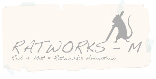
Well, after the enthusiastic response I got from Rob for the logo’s we had a brief discussion and decided that the grey logo suited the colour theme that we want to go for. So with a finished logo in mind, the next task, is to include it in our blog headers, and change the logo itself into a .png format with alpha channels, so we can quickly use it to watermark any work or images we use.
So, here is the logo in .png with alpha channels (Rob you should be able to download it straight from here, if not I’ll email it to you).
The first thought was to simply add the full logo in the bottom right (pretty much how I intent to use it as a watermark).
But, honestly it feels like a totally unpolished header, so I went back to the logo file and removed the text from it, just for use in the header, and came up with these:
Which I actually quite liked, the first one in particular, though I feel the sizing and positioning should have been somewhere in between the two... Then I had another little thought, so I took some liberties with the whole design and came up with these bad boys:
Wocha reckon then Robear?


Taking liberties?! :p
ReplyDeleteWell it seems our minds work very parallel because I had a go at developing a banner myself and had the exact same ideas! I like the first of the "polished ones" and agree that the positioning should be more central. The sizes of the first I like too :D
As for the bad boys at the bottom I'm not too sure...I don't think that the font gels very well with the back ground but it's a good concept :) Just needs some reworking to get the composition right...I think it's because its real cheese and a computer generated image that's the problem :/
If there is a way to make it look as if it were scratched into the cheese that might be cool?! Any thoughts? Maybe Mudbox/ZBrush as a challenge for us :P
Oh or maybe just have some cheese crumbs as opposed to a big block...
I think we could definitely develop it! :)
Hmmm, ok I see what you mean, I could have a go at making a vector version of the cheese, will make it look a bit more cartoony, and I'm not sure about scratching into the cheese... Wouldn't really know how to make that effect but I'll have a go...
ReplyDeleteYou like the cheese idea then? Or would you prefer to stick with the original paper theme? I'll make up the inbetweeny paper one aswell, it's only a 5 minute job...
Haha, well I'll see what I can do in Mudbox with regards to scratching...don't hold your breath though coz I haven't properly used it yet...
ReplyDeleteVector sounds possible, but it looks quite classy now and I think adding too much cartooniness...that's a real word...will probably clash. Don't know til you try tho! :)
Keep me up to date and I'll have a play in the Mud...box :p
If not we can stick with the paper theme for now