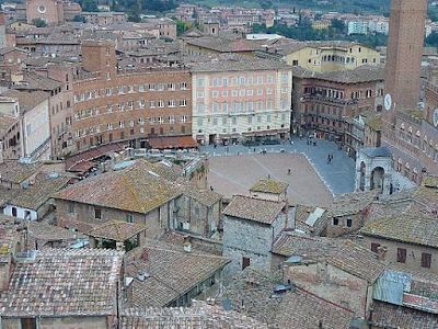
As I said in my previous post, after seeing the grainy picture of the square in Siena I decided to have a proper look at it.
Here is a beautiful panoramic view of the square. I had to break it up into sections to fit on here, but you can still see layout and get a sense of scale here:
I like the diversity in the design of the buildings, particularly in the first image (the left of the square), with small gaps between some buildings and varying heights too. A little too much of the same colour... But as I said, we can change that easily!
Here is an overhead view from Google Earth, you can see just how close the layout matches that of our initial set development sketches (here):
This is an awesome example for us of a square as the layout and building design so closely resembles what we've had in our minds! The colours aren't as we'd like but this is a very good reference for building design.
Lunch time! Off I go...


No comments:
Post a Comment